User Testing • UX Writing • Lo-Fi Wireframing • Video Editing
BACKGROUND
Memoire is an early stage Augmented Reality (AR) application that allows users to send and share photos to be played as videos with the use of the app. Users select a video clip from their phone and choose a photo still. The still is sent to the user’s friend or family. Once they receive the still, they place their phone over the photo to play the video.
ROLE
CHALLENGE
Product Designer
Explaining the concept of Memoire, an AR app, to new users, without their being able to experience it for themselves.
FINAL SCREENS
We started the process with preliminary market research on similar companies that allow users to share and create AR photos. I made three distinct personas: a giver of Memoire (Matthew, 22, California, tech Savvy), a receiver of Memoire (Karen, 60, Ohio, not as familiar with technology), and an unnamed person who orders a Memoire for themselves.
We conducted usability testing with 8 individuals, half of them as givers and the other half as receivers. The results were conclusive: people did not know what Memoire even was.
“I don’t know what I’m buying. Is it 12 frames, or 1 frame?”
“It’s printing your photo into a physical product.”
“What does that icon do? It’s not clickable.”
Though the founders were aware of this problem, through user testing we were able to identify three primary pain points, listed below.
PAIN POINT #1: CONFUSION OVER WHAT APP IS
The central problem we were asked to solve and confirmed through user testing was that users did not know what the app was. Though the app creators could have solved this problem through marketing, they also wanted to communicate it with the onboarding flow. The issue that we uncovered through testing was simple: no one watched the video.
GOING THROUGH ALL THE OPTIONS
We went through multiple iterations of an on boarding flow. The challenge? Explaining what Memoire was in a way that would catch user’s attention, without creating resentment (i.e. “I just want to go to the app, why are they making me watch this?”). We worked from the assumption that people don’t want to sit through long videos (verified at the beginning) or read paragraphs of text.
BREAK IT DOWN FOR ME
To make users more receptive to information, we broke it down into bite-sized chunks on multiple screens. Words and pictures were paired together for maximum clarity.
I aimed to have an onboarding flow that was as short as possible, because users confessed during testing that they would skip it if given the chance. Though the number of screens was more than I had initially hoped, the total time it took users to navigate them was still short. The fact that users had to swipe in order to get to the next page made the flow fast and engaging, but also prevented them from ignoring what they read.
PAIN POINT #2: MISLEADING ICONS
The first screen that the users saw after completing the on boarding flow was the home screen with two navigation icons: one for creating a Memoire, and the other for Activating one (the central icon was meant for scanning).
User testing revealed that people did not understand the symbols that were used to indicate “Create a Memoire” and “Activate a Memoire”. They often clicked the wrong icon for their intended action.
SYMBOLS AREN’T ENOUGH
Multiple versions for the symbols “create a memoire” and “activate a memoire” were tested. Users never identified any one symbol specifically with the actions for “create” or “activate”, but were helped substantially with the addition of text.
The plus icon with the word “create” was the most successful in user testing. Tests were conducted with paper prototypes. I discovered the plus icon by doing a google image search of the term “create icon”. Below are the many iterations of icons for the landing screen.
GO WITH THE FLOW
The User Flow remained the same. Clicking the symbol labeled “activate” led to a screen where users could input the activation code that came with their Memoire. Clicking the symbol to “create” initiated a screen where users could begin the process of creating a Memoire.
PAIN POINT #3: UNCERTAINTY ABOUT CODE
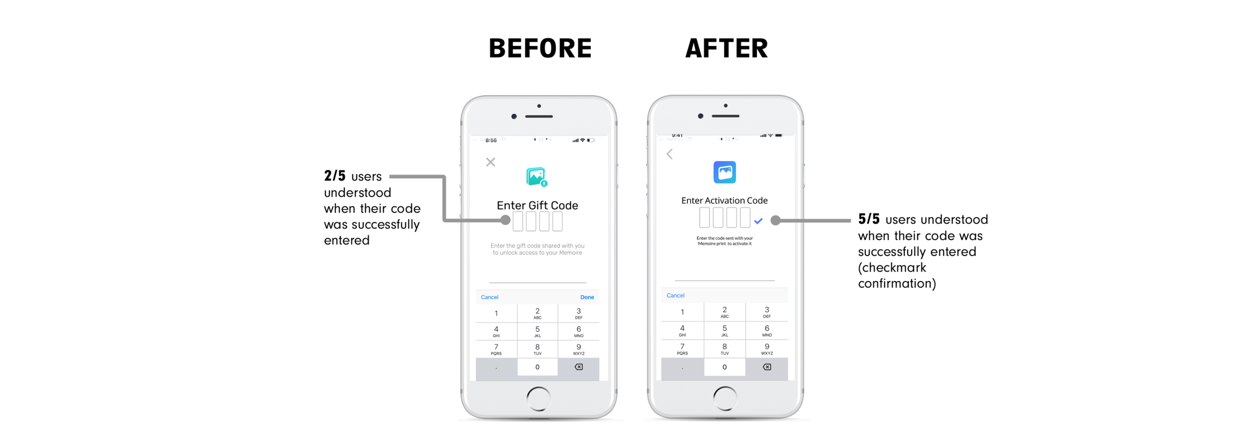
Though the “create” page was not within our scope, the “activate” page was. Before a receiver can view a Memoire photo, they must enter a code on the “activation” page. Users expressed many concerns throughout this process. The most prominent was the uncertainty that they felt after entering a code because they lacked confirmation.
Users entered their code, and then… nothing.


