
Overview
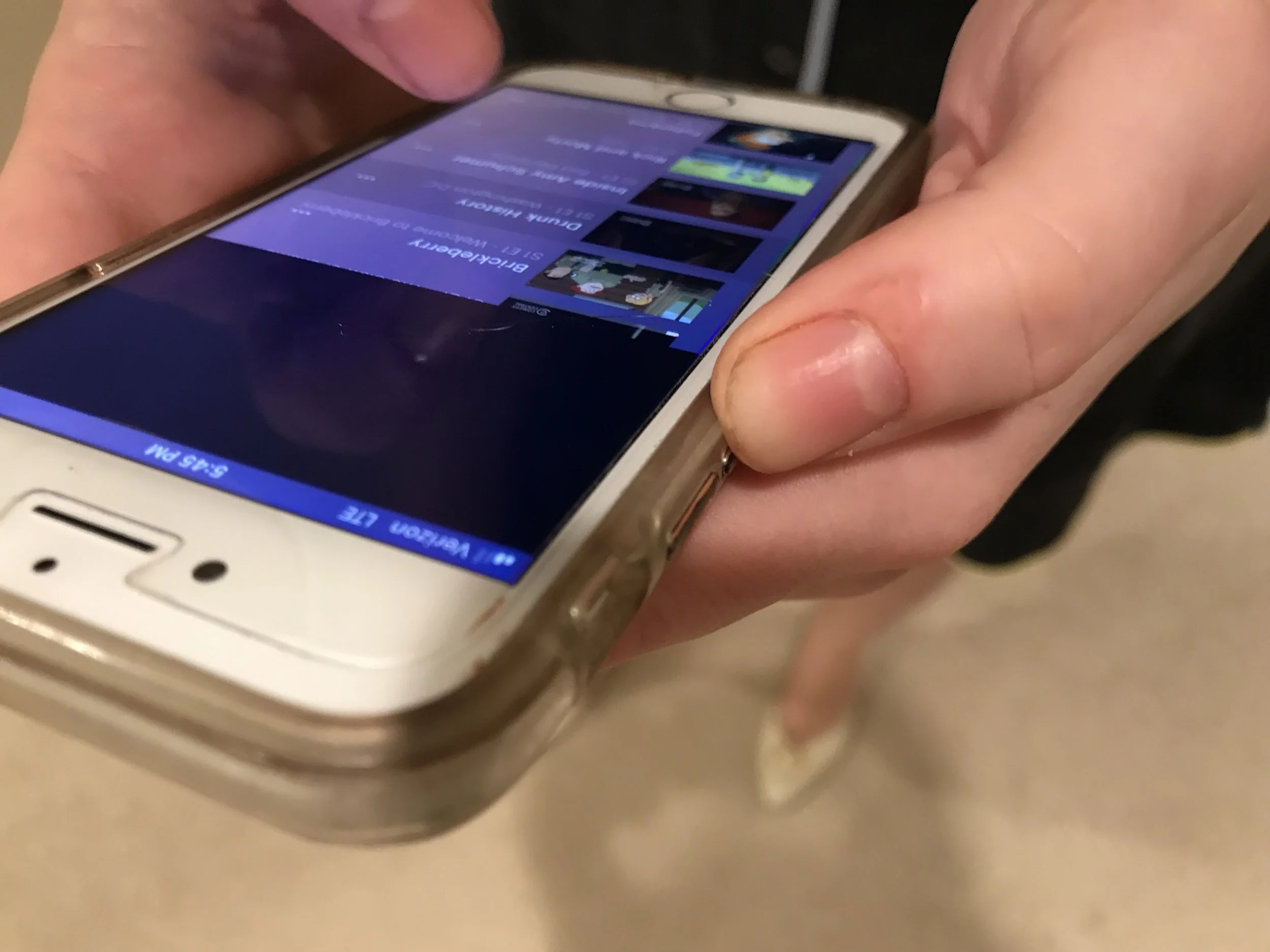
Hulu is a website and mobile application that allows paying users to watch TV and movies on demand. My parents like to watch international TV shows (which usually require a subscription), and have asked me many times for assistance in using the website. This is what lead me to reimagine a few pain points in the app.
Background
Individual Product Designer. Disclaimer: I am in no way affiliated with Hulu.
Role
Usability Testing, Painpoint Analysis, Sketching, Hi Fidelity Mockups, Prototyping
Scope
Make it easier for users to watch the episodes they want to watch, as well as add and manage subscriptions.
Goal
Final Screens

Results
I was able to reduce the number of clicks required to select a new season and episode from 6 to 3, as well as allow users to add a new subscription from their mobile device. Users are now able to view their current subscriptions as well. This has a positive benefit for user experience and hypothetical business goals.
Personas
Though I initially set out to optimize my app for an older generation, research revealed that the average age of a Hulu user is 31.
My proto persona is a 31 year old Hispanic woman named Sara Hernandez who lives in the Midwest (possible Montana). She makes an average of $95,000 a year as a paralegal. She likes to watch television comedies in order to distract herself from the current political climate.
Her favorite animated show is South Park, one of the most popular animated shows on Hulu (Americans streamed more than 107 million hours of South Park on Hulu in 2017.).
Disclaimer: This is a proto-persona (not a validated persona), based loosely on statistics that were published in Forbes Magazine and Fast Company.

The Lovely Sara Hernandez
Guerilla Usability Testing
I asked 7 users to attempt to use the Hulu App. The subjects included bookstore workers at the SF Ferry building, bookstore workers at Barnes and Noble, bookstore browsers, and my parents (the original inspiration). Users were asked to complete a series of tasks
Synthesis
When combing through my notes from guerilla usability testing, I found commonalities among the user complaints, and decided to illustrate these through an affinity map. Each user is represented by a color. This provided a clear visual representation of the pain points that were most common, and therefore most necessary to solve.

Prioritization
In order to prioritize effectively, I arranged the most common pain points in a 2x2. I decided to map them according to importance to user and business value. The pain points that were mentioned most frequently were assumed to be most important to users. The top 4 pain points fell in the top of importance to users, and importance to business.
Though many users disliked the listings under the videos, “disliking listings under video” was more of a UI problem than a usability problem. Therefore, I decided to focus on the 3 pain points to the right of it (Can’t view account info, Can’t add new subscription, Couldn’t find Seasons), and come back to the issue of the video listings later.

Pain Points
Pain Point 1 - Selecting an episode
Pain Point 2 - Adding a new subscription
Pain Point 3 - Viewing account information
Task Flow
I decided to create a task flow in order to better illustrate where users were getting stuck in the “Selecting an Episode”, “Managing an Account”, and “Adding an Add on” Flows. These actions are highlighted in red. The new task flow is featured below, with the solutions highlighted in green.
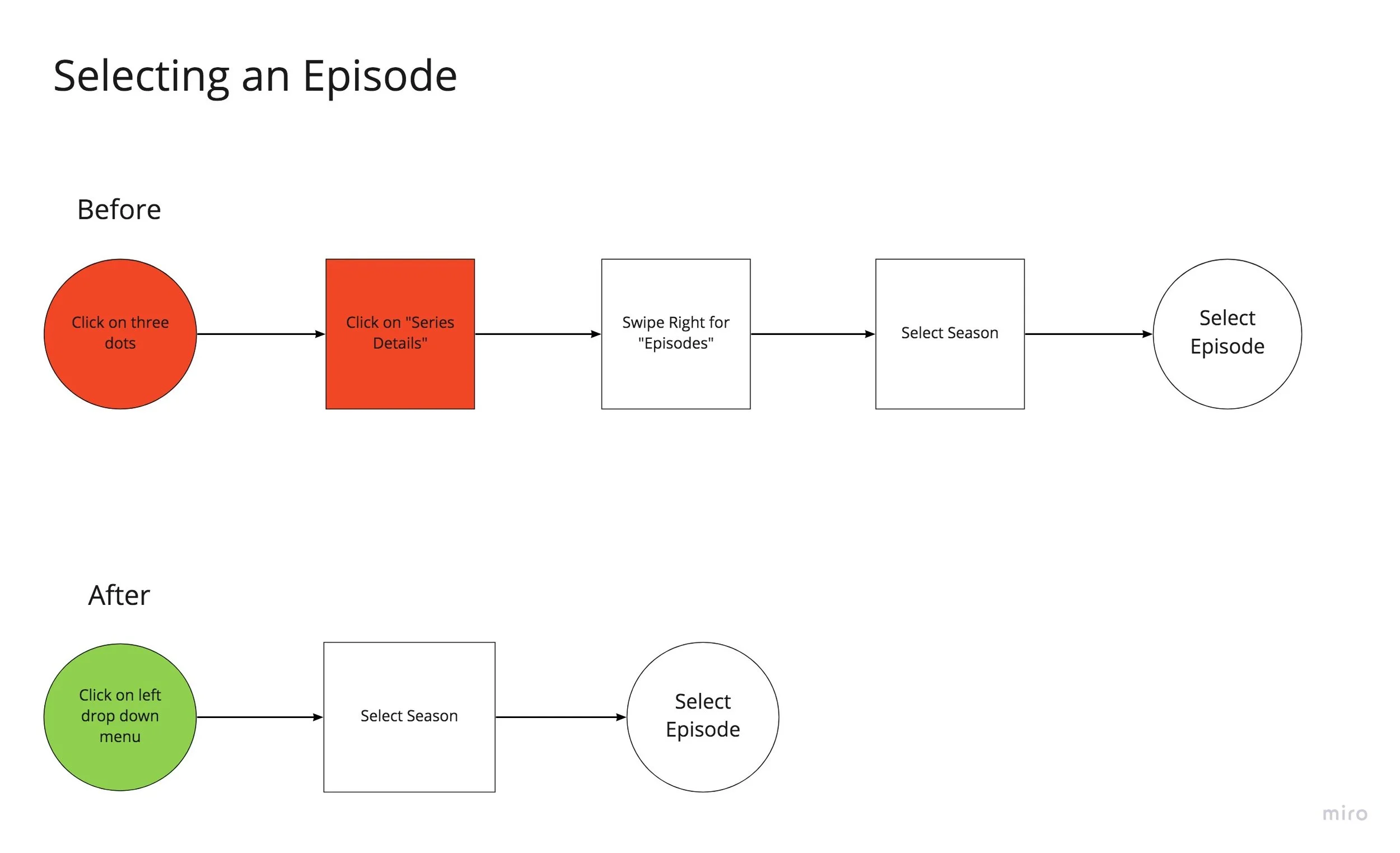


Episode Selection - New User Flow

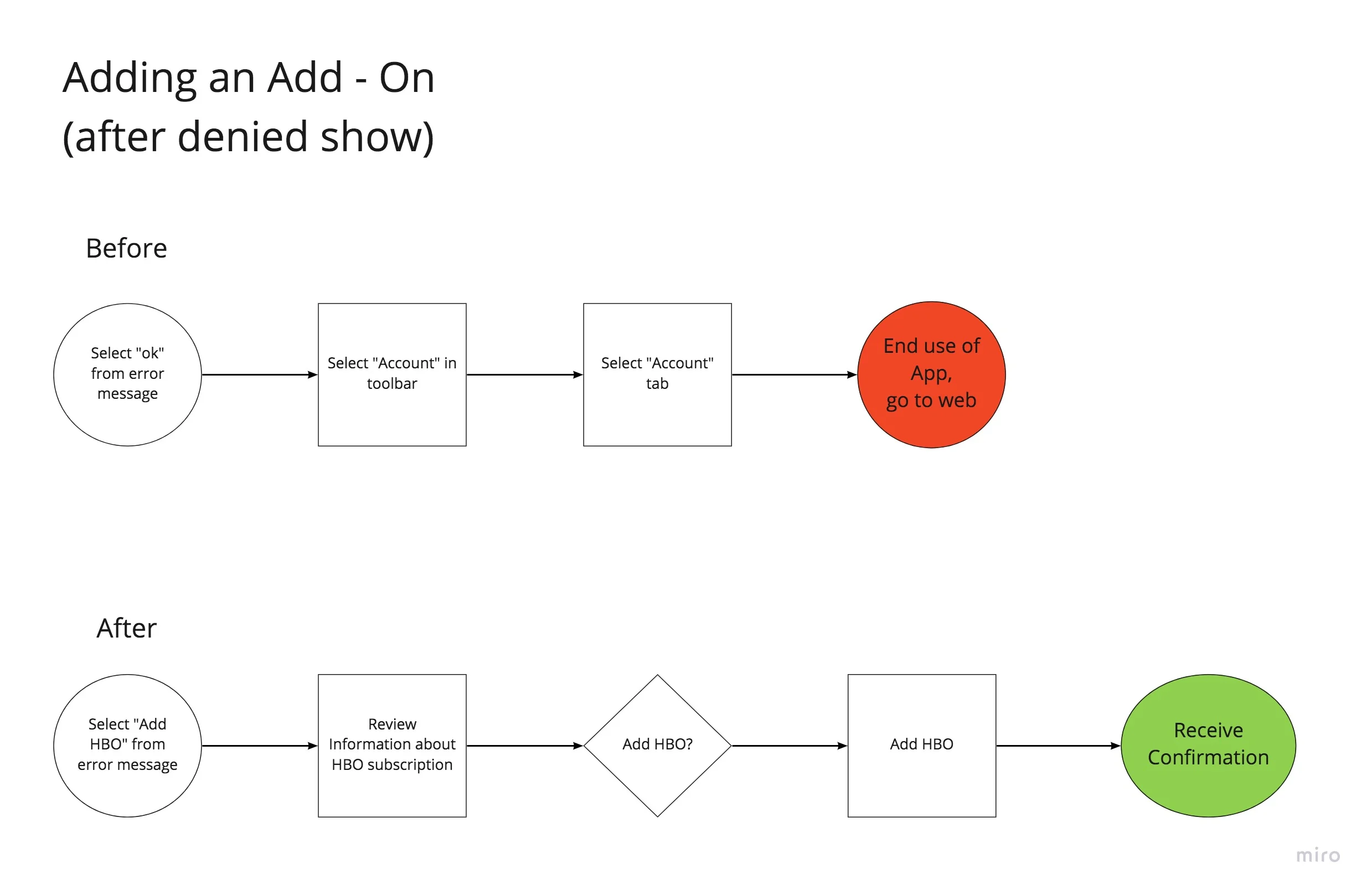

Error Message - New User Flow


Managing Account - New User Flow

Ideate
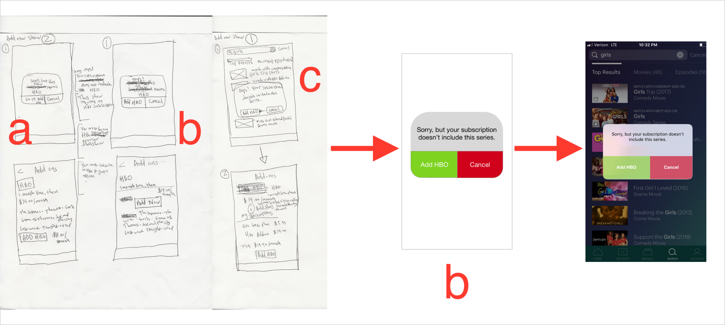
In order to effectively come up with a solution to the problems I found, I decided to make at least 3 lo fire wire frame drawings for each pain point. After making these drawings, I asked people I knew for their input.
One example - someone told me that I should not use the phrase “Go To Add-ons” for the “Adding a new subscription” screen. This is because “Go To Add-ons” could be unclear to a person less familiar with the terminology of Hulu. For this reason I chose to use the term “Add HBO” instead.
Many of the choices in my final hi fi drawings were inspired by the designs already used by Hulu. The color scheme remains the same, so that the pages seamlessly integrate with the rest of the app.
